NUTREX HEMO-RAGE NEW IDENTITY DESIGN
Project Overview
NUTREX is a legendary name in the high-stim pre-workout category known, trusted, and
respected by a core audience that values intensity and performance.
As the market evolved and a new generation of athletes emerged, the brand
set out to reignite its presence, modernize its image, and prove that Nutrex, HEMO-RAGE
is not only still alive but stronger than ever.
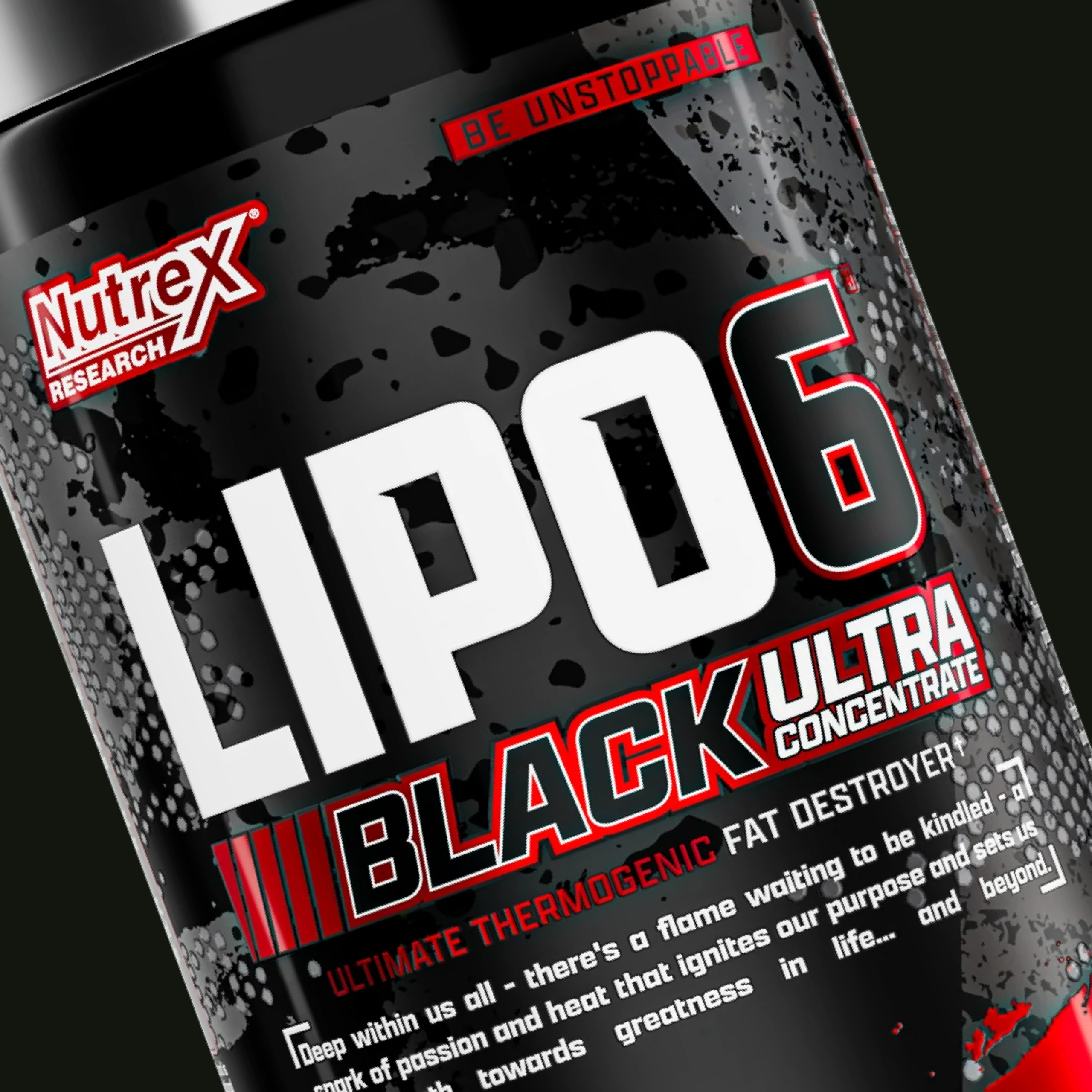
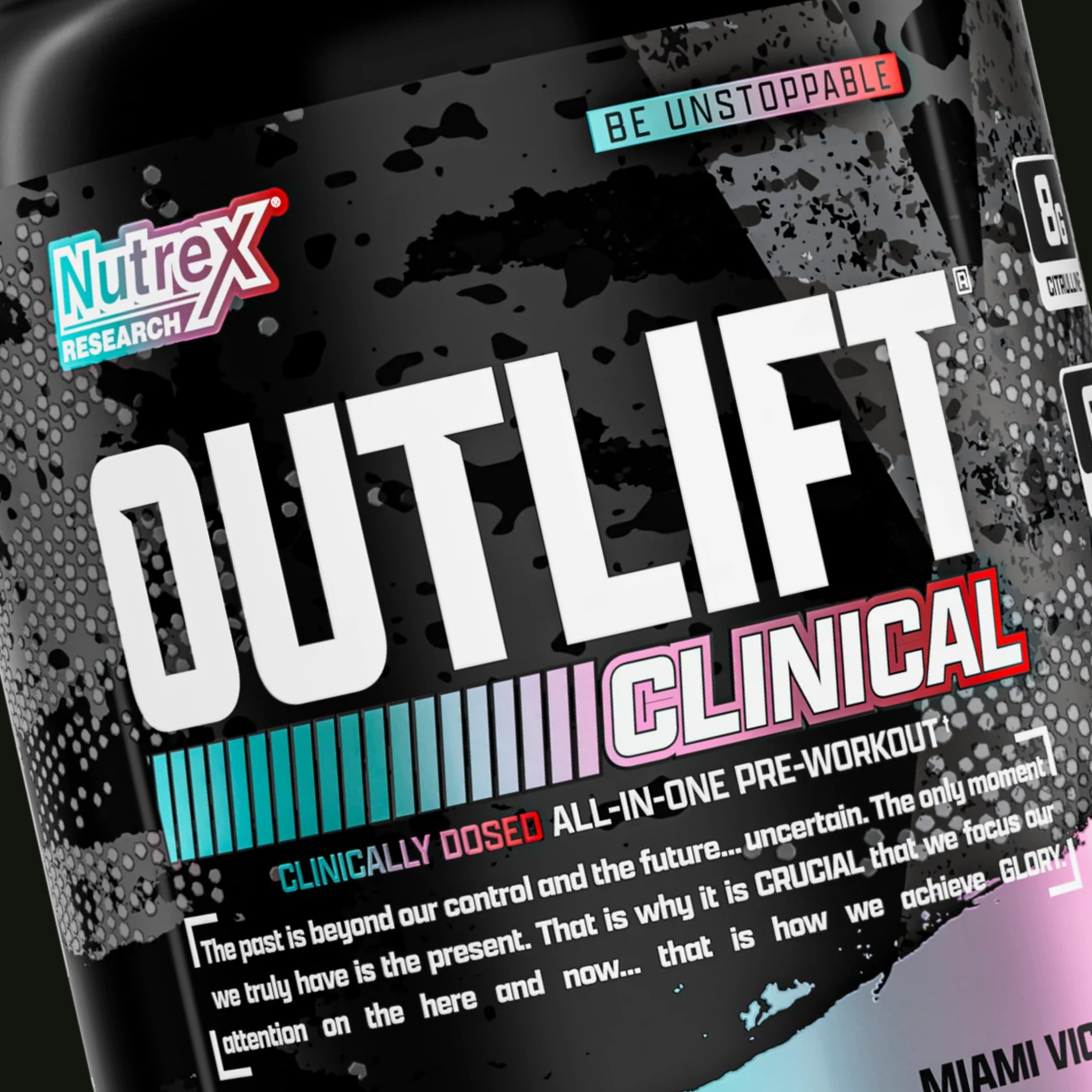
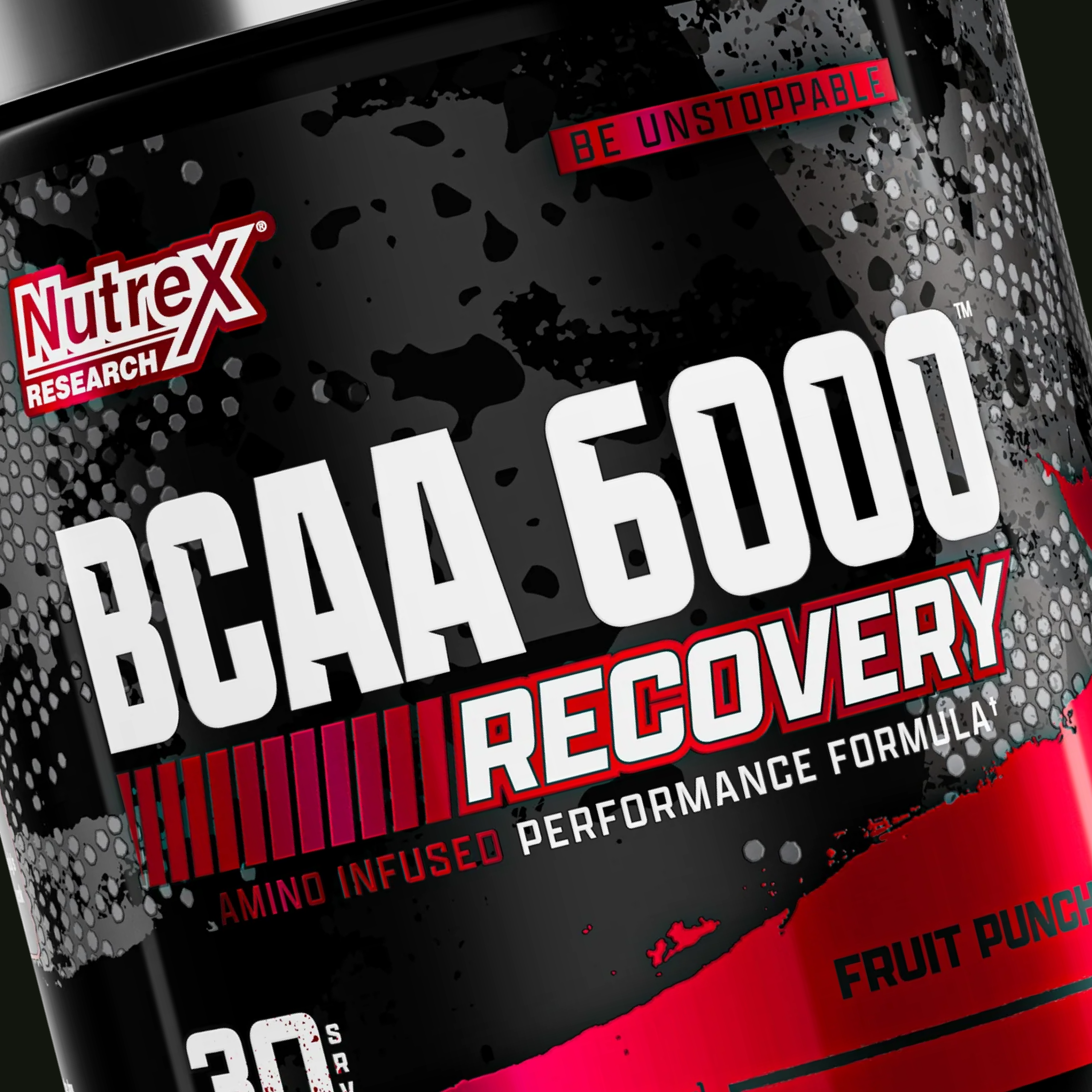
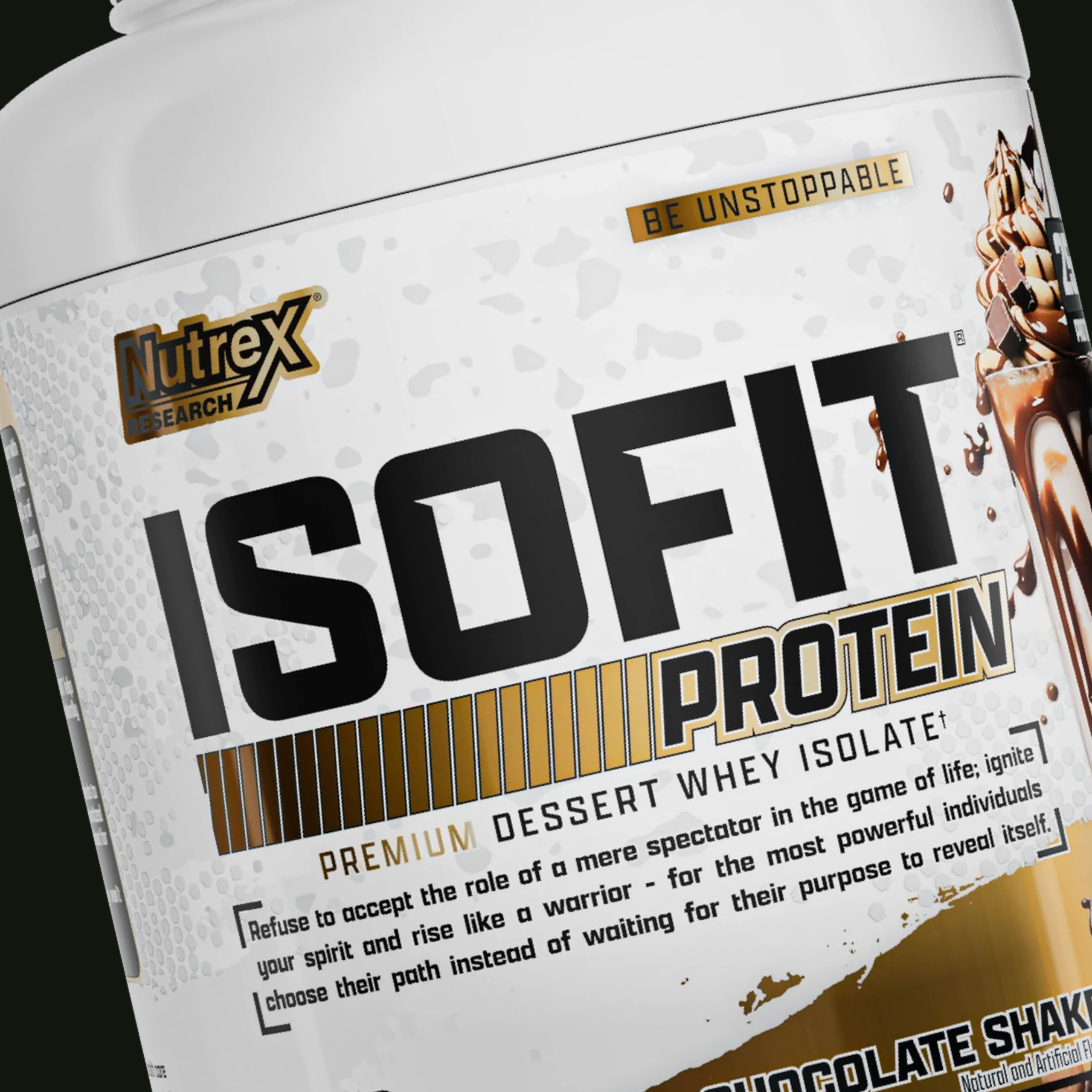
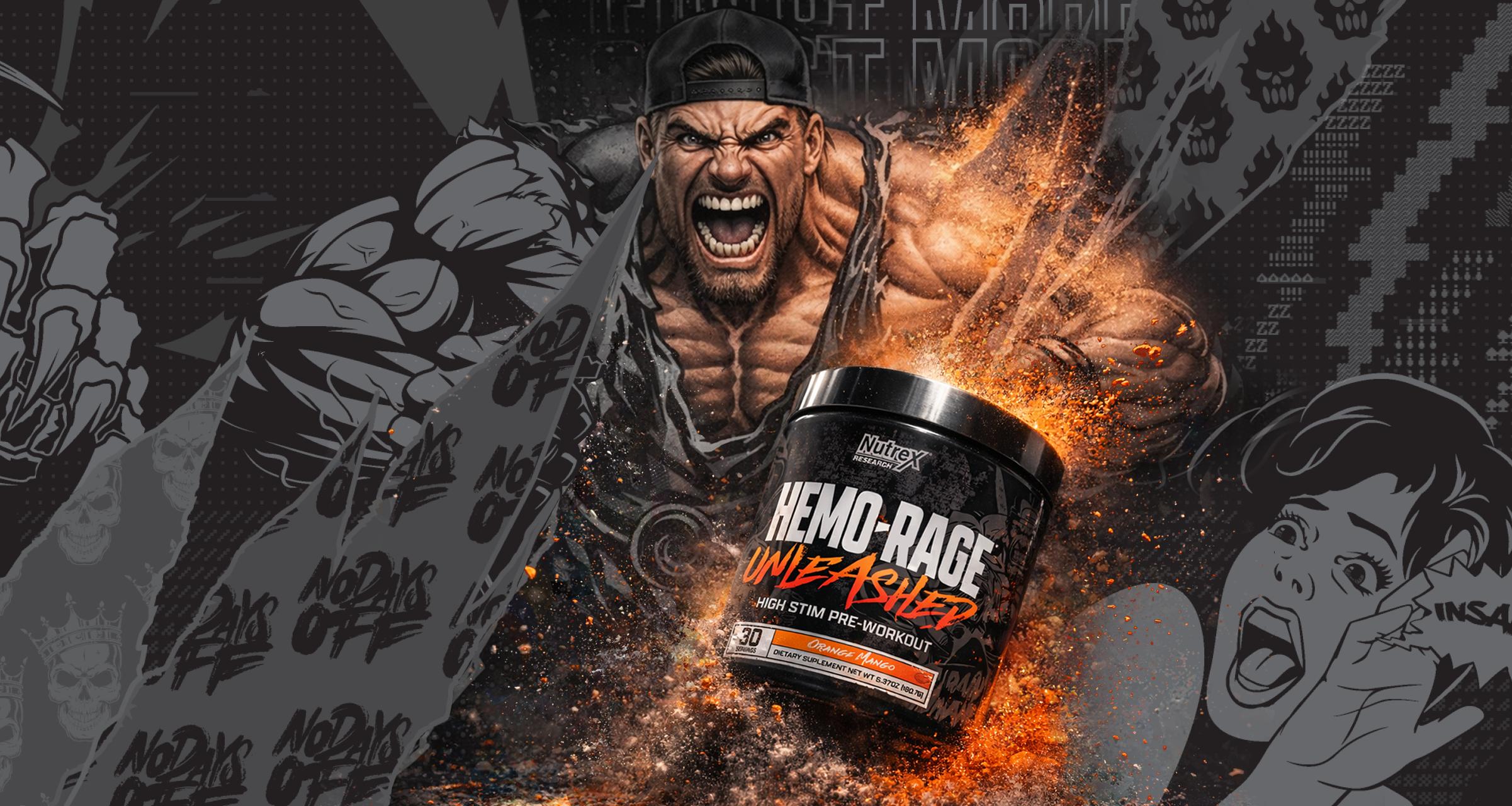
The visual direction typography and packaging redesign by Iván Hernández, graphic designer.
Challenge
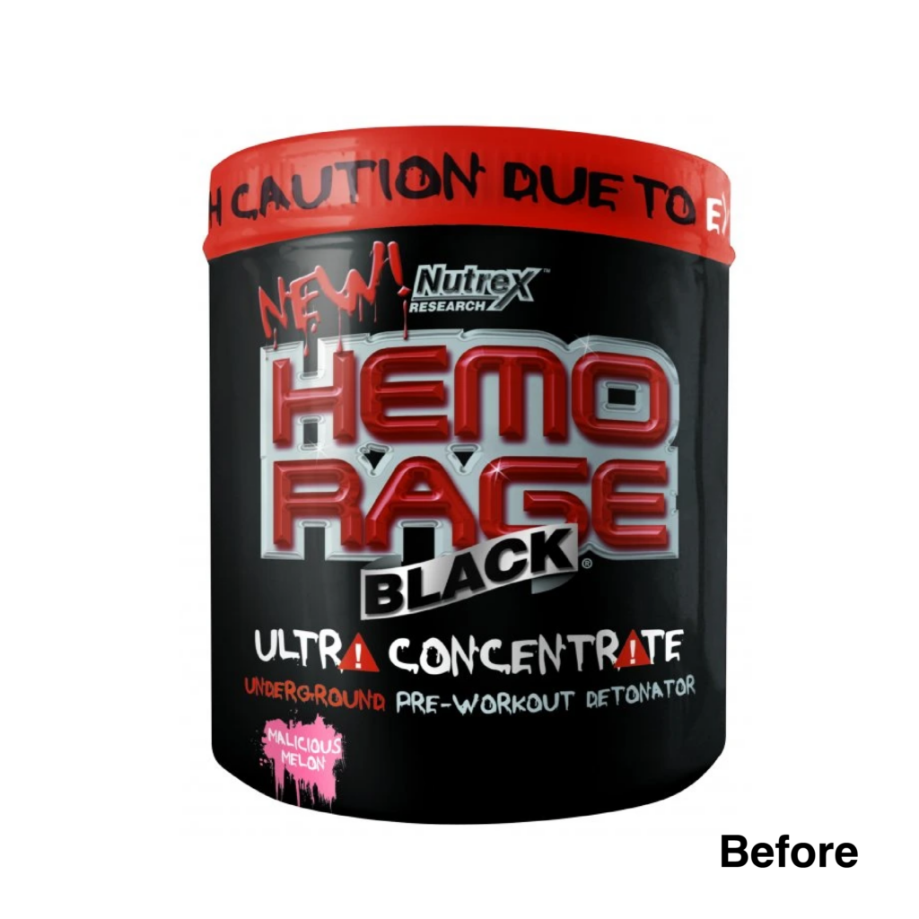
Revive an iconic brand without losing the raw power and credibility that made it famous. its visual identity no longer reflected the energy, attitude, and expectations of a younger, modern fitness audience. The brand needed to reconnect with the next generation while maintaining its hardcore legacy.
Solution
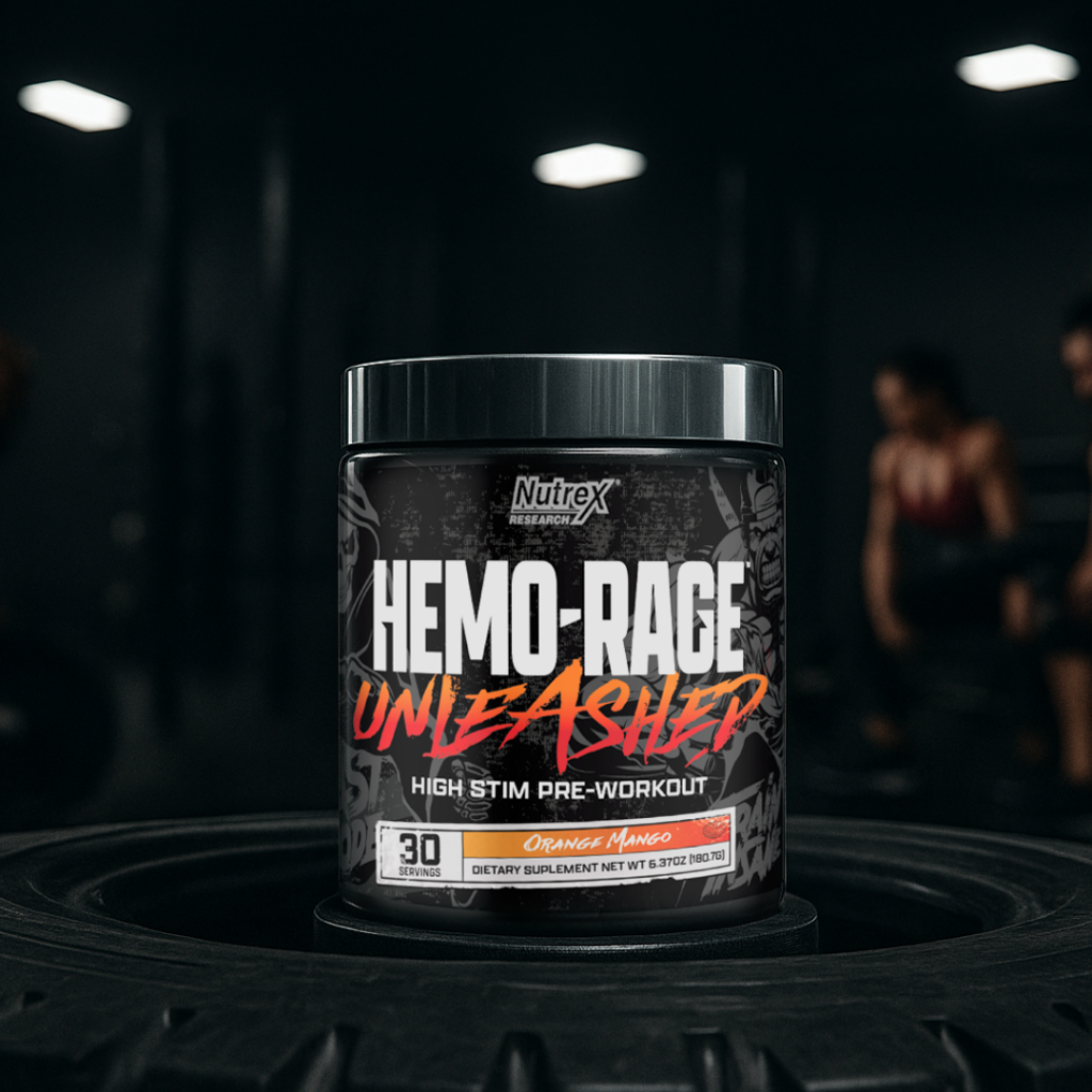
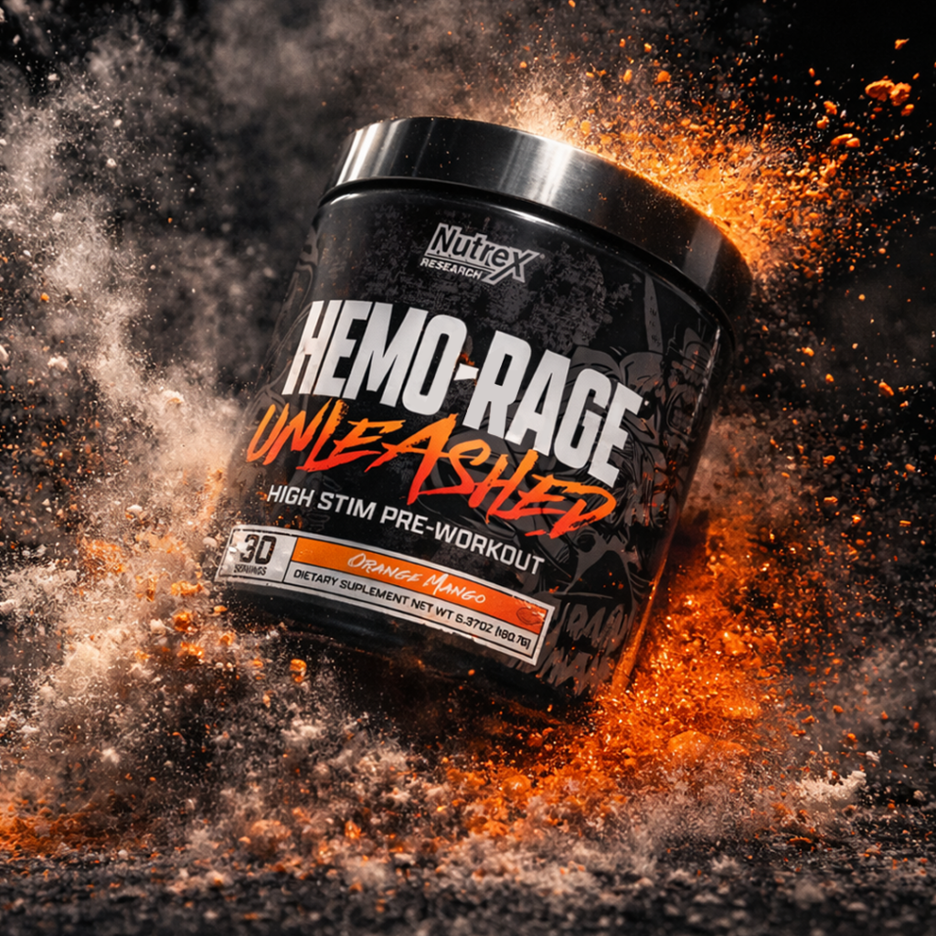
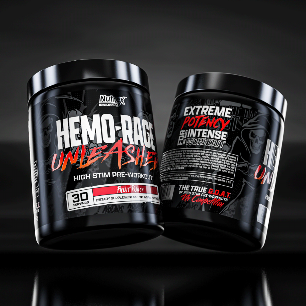
I reimagined the brand through a bold, modern design system that amplifies intensity, clarity, and confidence. The refreshed packaging balances aggressive energy with a cleaner, contemporary structure—signaling evolution while staying true to its roots.
Results
Along with other products HEMO-RAGE returned with a stronger, more relevant presence, resonating with both loyal users and next-generation athletes. The new identity reinforces trust, boosts shelf impact, and positions the brand as ready for the future of performance.
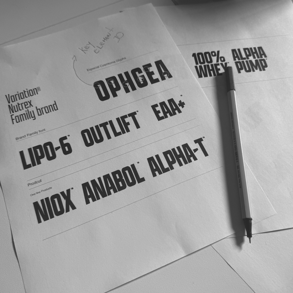
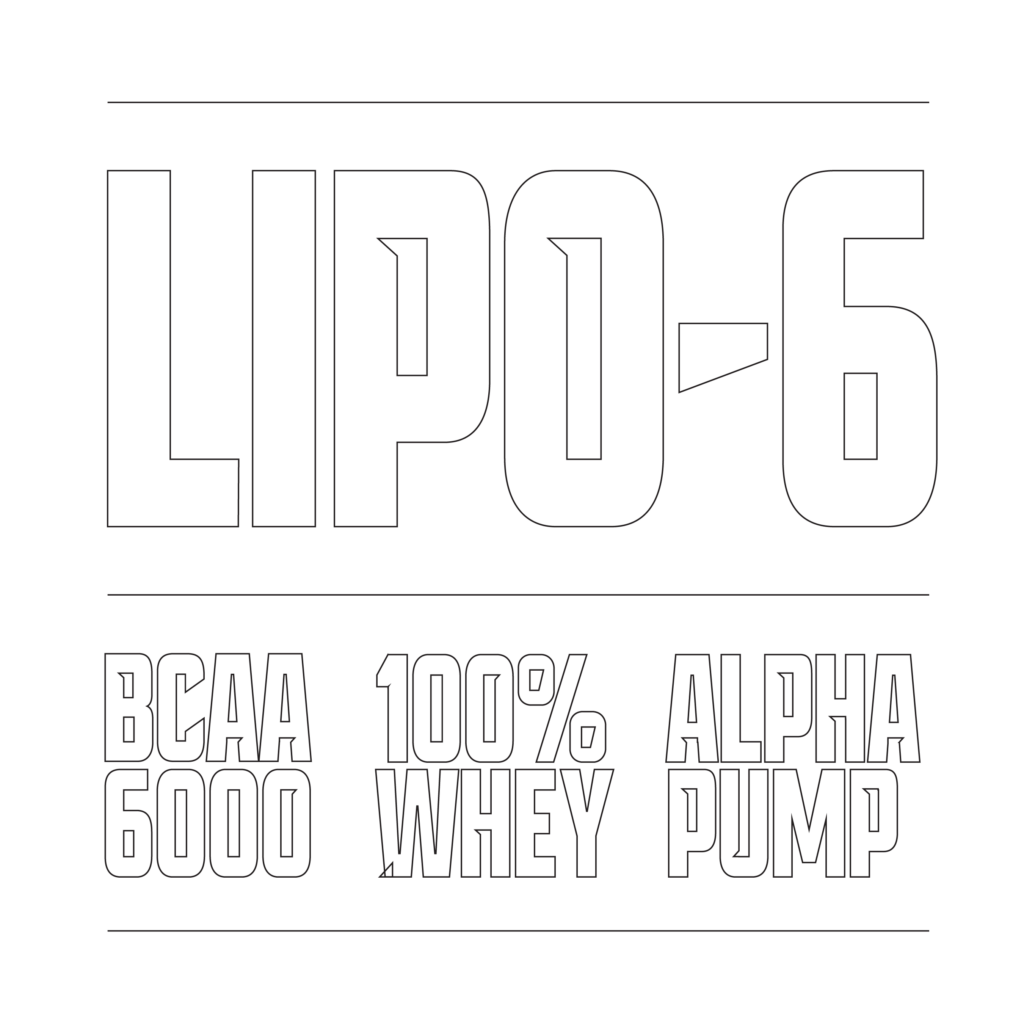
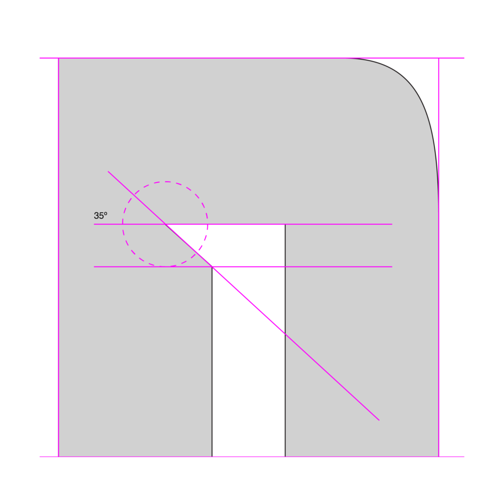
Typography Creation
As part of the Nutrex branding process, I found a product line with a highly diverse and disconnected visual identity. When I placed the full range together in one frame, it became clear that the brand lacked cohesion—each product felt visually separated from the next, creating a confusing message for customers and weakening recognition in the market. A strong design on its own was not enough; the brand needed a connective element that could unify the portfolio while still allowing each category to express its own character. After extensive development, I identified typography as the key structural solution. I created a typographic family that brought consistency across the line while giving each product the flexibility to maintain its own personality. Although I designed Hemo-Rage specifically, the typographic system became a foundational element of the brand and continues to support the visual structure of Nutrex today.