BROOKSTONE PACKAGING REDESIGN
Project Overview
This Brookstone packaging redesign by Iván Hernández, graphic designer,
focused on creating a clearer and more premium visual identity for the brand.
Through improved hierarchy, cleaner composition, and a more refined
packaging system, the project helped transform Brookstone’s retail presence
into something more mature, cohesive, and aligned with higher perceived quality.
Challenge
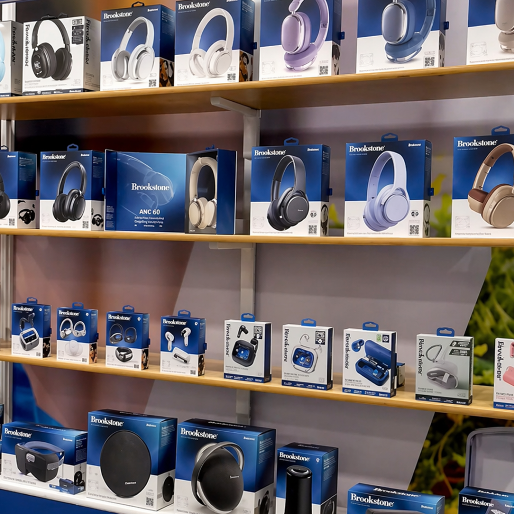
Brookstone had built recognition through a louder and more visually crowded packaging style, one that relied heavily on color, information, and intensity to compete for attention at retail. While that approach may have served the brand in an earlier stage, it no longer reflected the level of quality, maturity, and confidence the brand had earned over time.
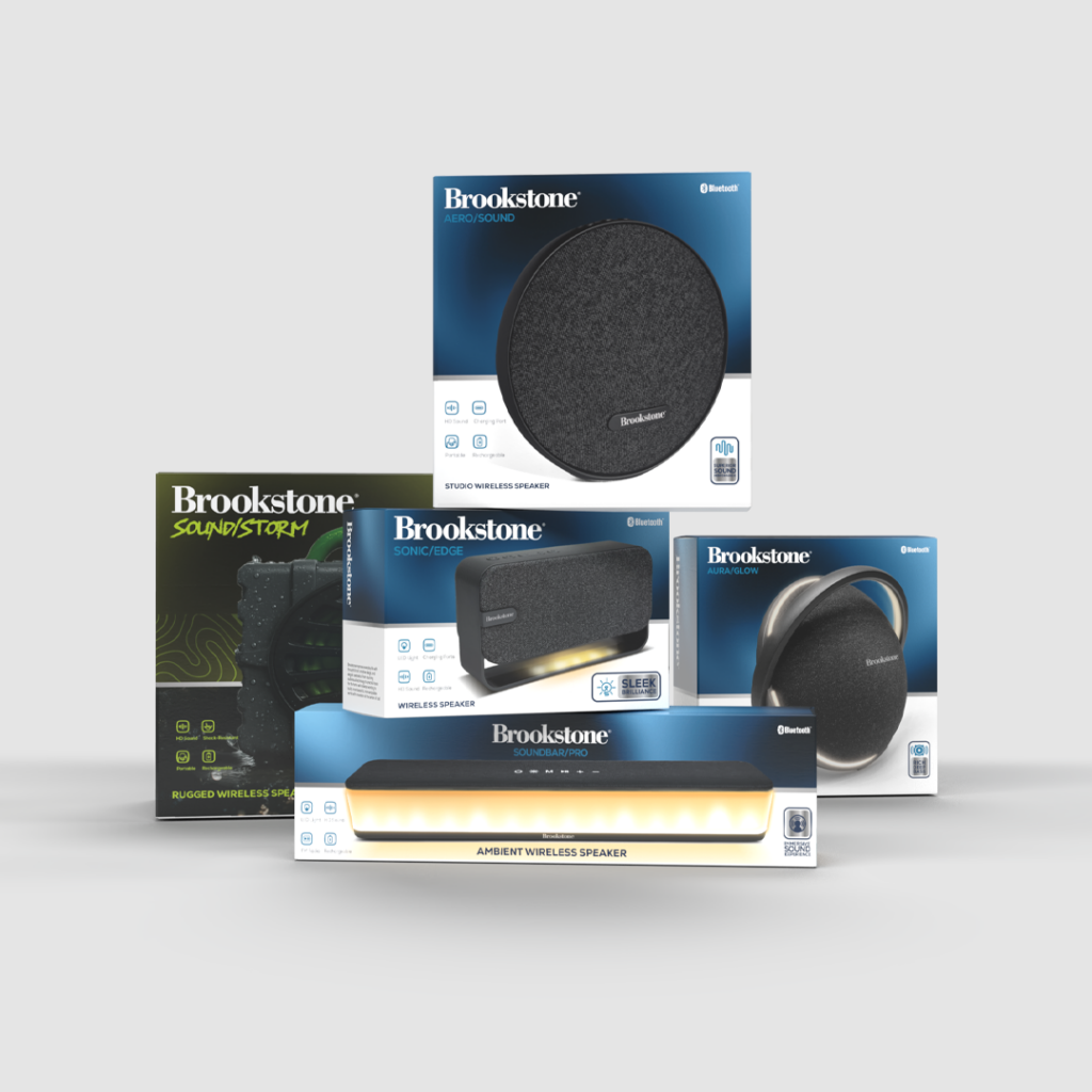
Solution
Instead of competing through visual overload, the new packaging was designed to communicate through clarity, structure, and confidence. This created a more polished identity that felt stronger at a larger scale, more cohesive across the line, and more aligned with the perception of a higher-quality consumer electronics brand.
Results
What once felt crowded and overly dependent on saturation was transformed into a system that spoke more clearly for itself. The new identity created a more credible and scalable packaging direction, helping Brookstone present itself as a larger, more confident, and better-defined brand.
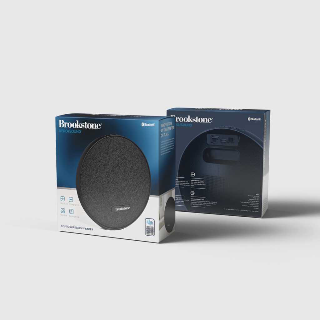
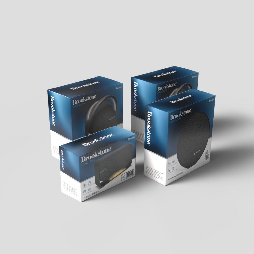
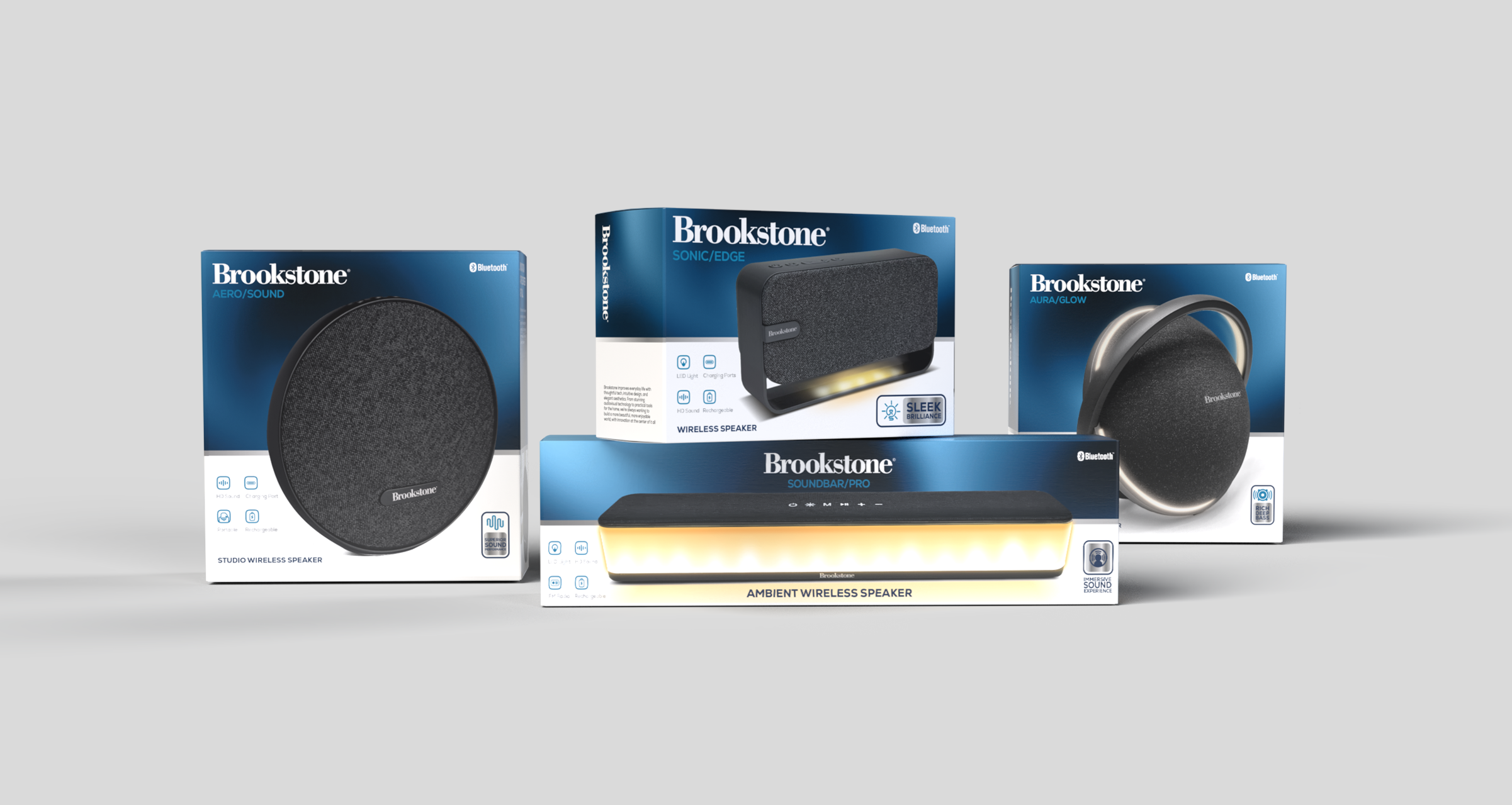
3d and Photographic Styles
Photography and rendering style are essential to how a product is perceived. Materials, lighting, angles, and composition all influence whether a product feels clear, premium, and desirable. My approach focuses on a clean and simple visual style that highlights relevant details, improves product understanding, and presents each piece in a more refined and credible way.
Support Graphics
As part of the redesign, I realized that the icons and graphic elements also needed to evolve. To support the new direction, they had to feel more authentic, modern, and aligned with the updated visual language. Many companies avoid pushing this part forward to save time, but I saw it as an opportunity to explore a new graphic system that better matched the identity.