BRINKO LABEL AND PACKAGING
Project Overview
Design by Ivan hernandez graphic designer, Brinko is a family-owned dairy brand
located in a small town near Bogotá, surrounded by natural landscapes, fresh air, and a deeply authentic way of living.
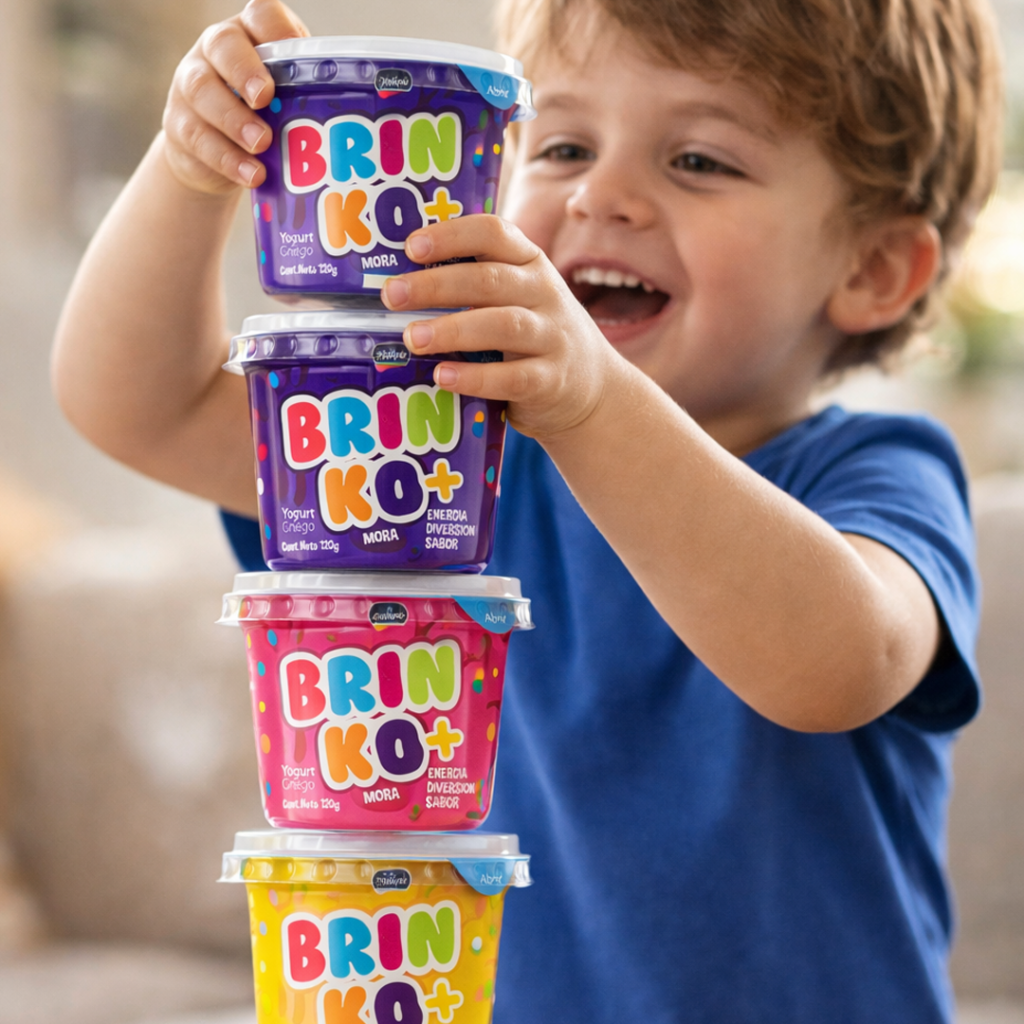
The project focused on transforming this local farm product into a retail-ready brand, designed to connect emotionally
with children while preserving the honesty and warmth of its origin. The brand aims to translate
that experience into a playful, colorful, and approachable product that stands out on shelf while remaining genuine at its core.
Challenge
The challenge was to evolve a traditional, farm-based product into a competitive retail brand without losing its authenticity. The transition required repositioning the product from a local, small-scale offering into something capable of standing out in a crowded yogurt category.
Solution
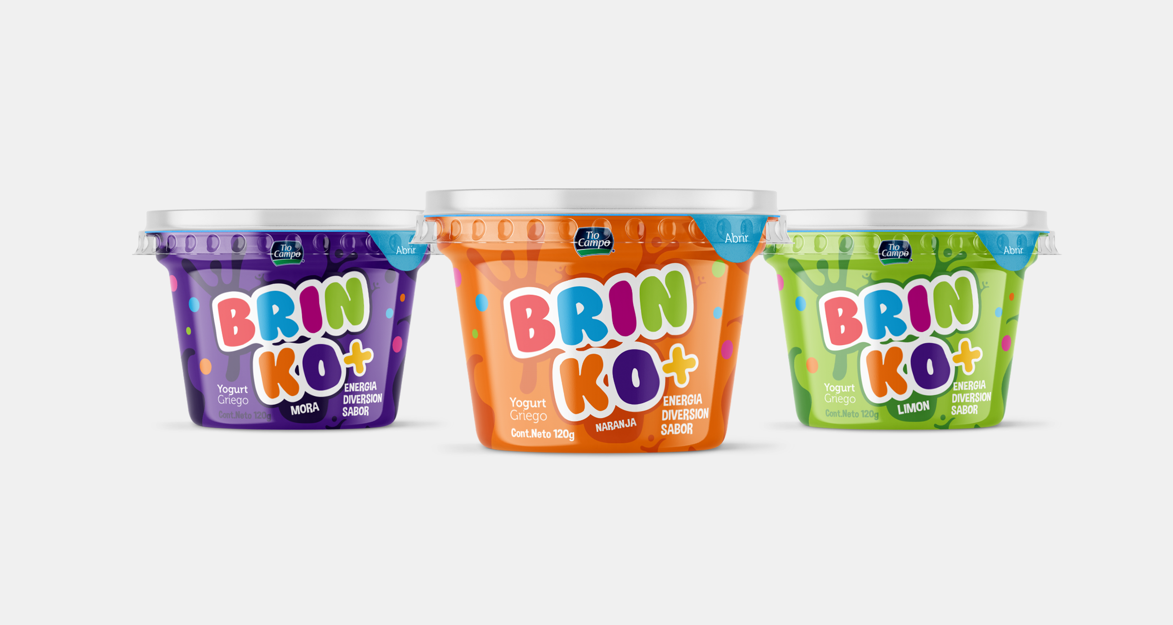
The solution was built around a vibrant and expressive visual identity system designed to capture attention instantly and create an emotional connection. A bold, colorful packaging approach was developed to resonate with kids, supported by a friendly and playful logo system with soft, rounded typography.
Results
The final outcome successfully transformed a local farm product into a retail-ready brand with strong visual presence. The packaging achieves clear differentiation within a saturated category, while maintaining a genuine connection to its origins.
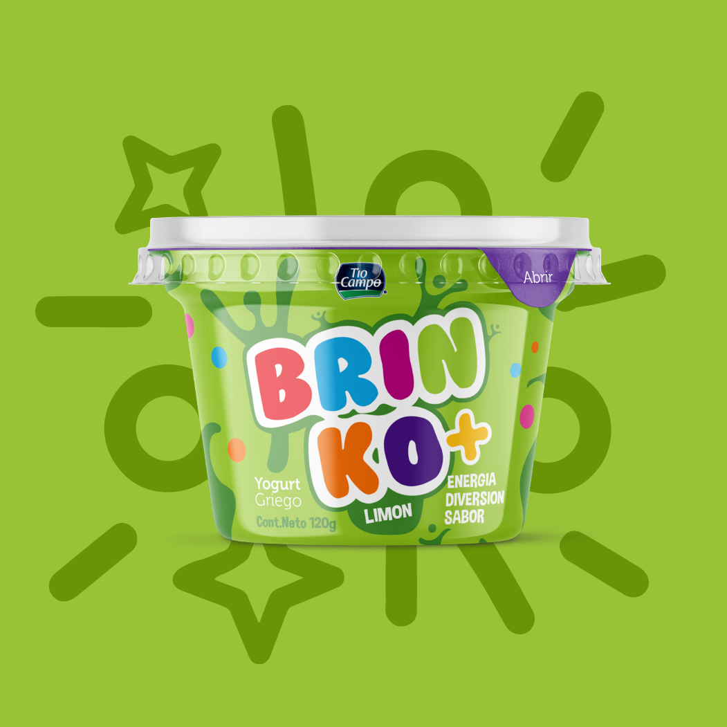

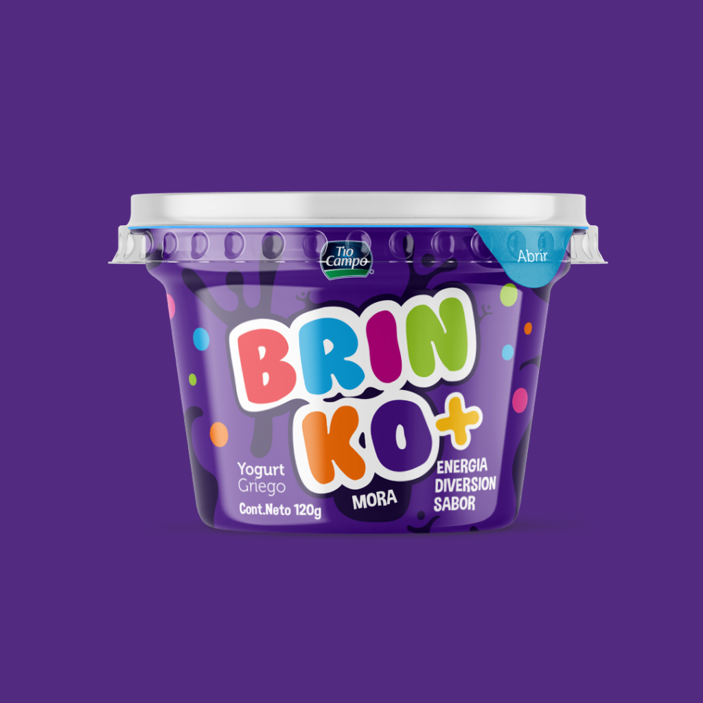
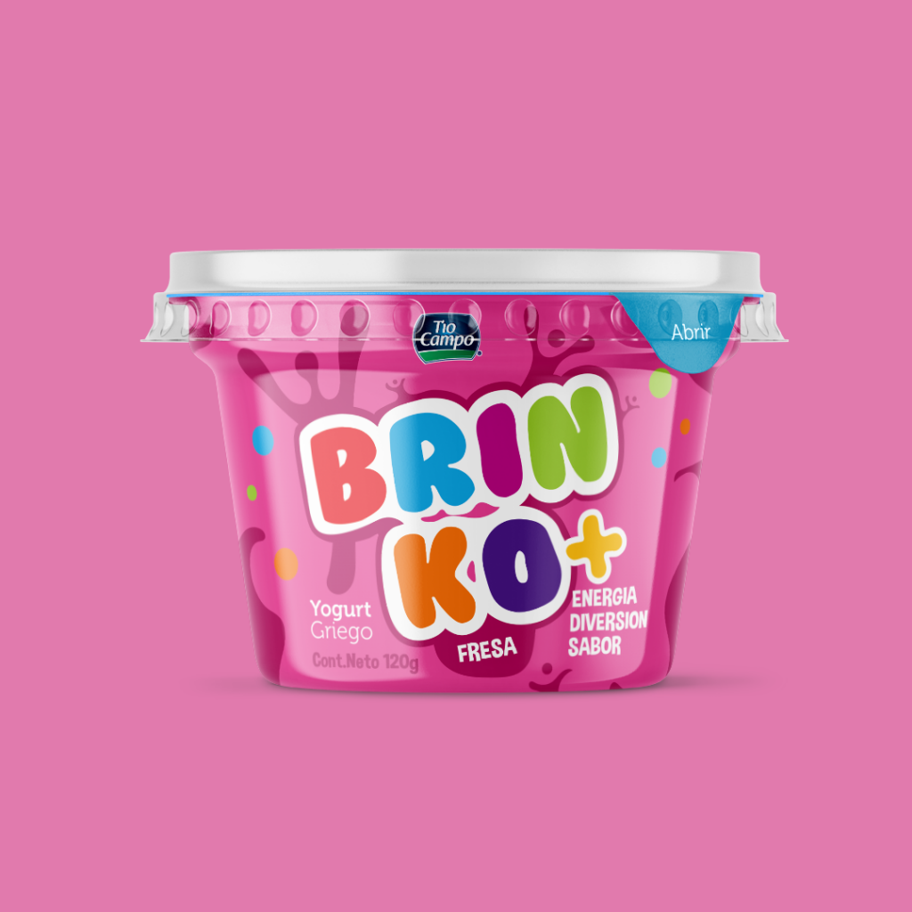
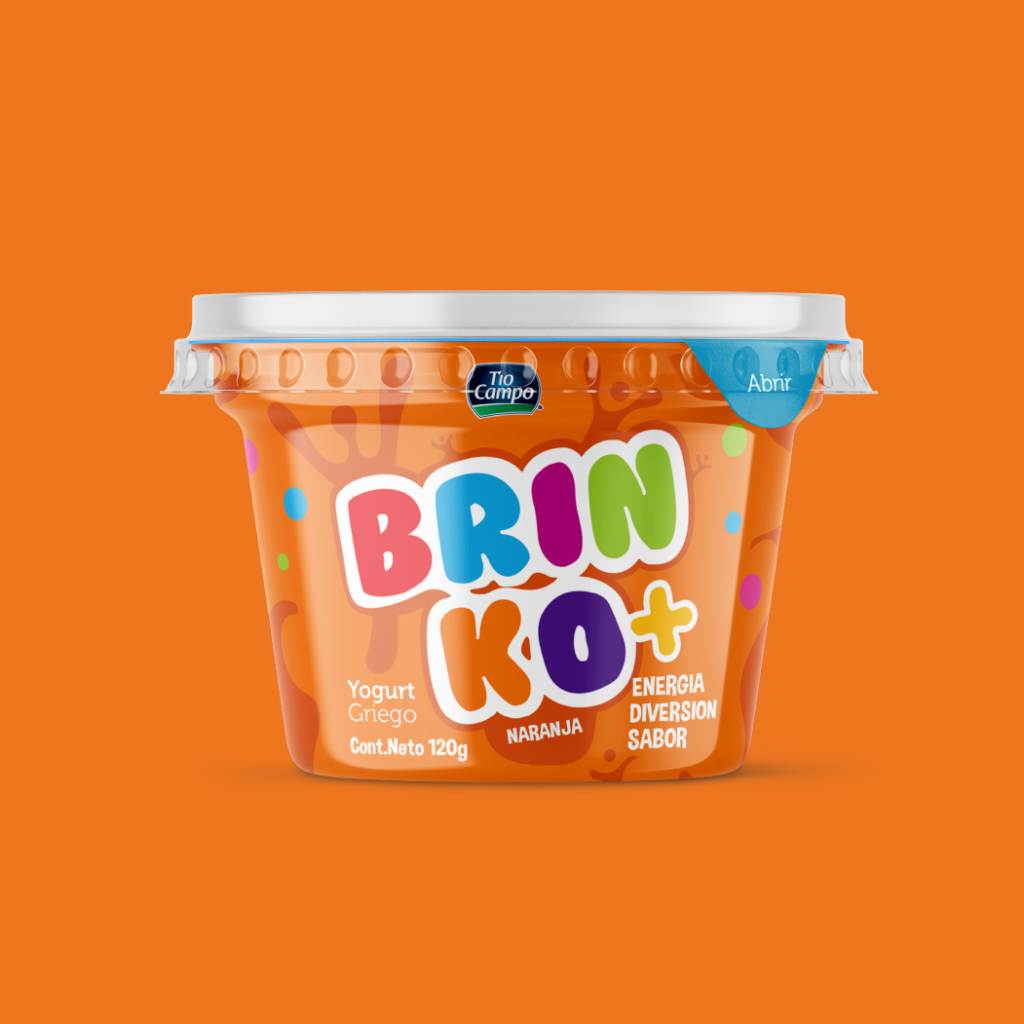

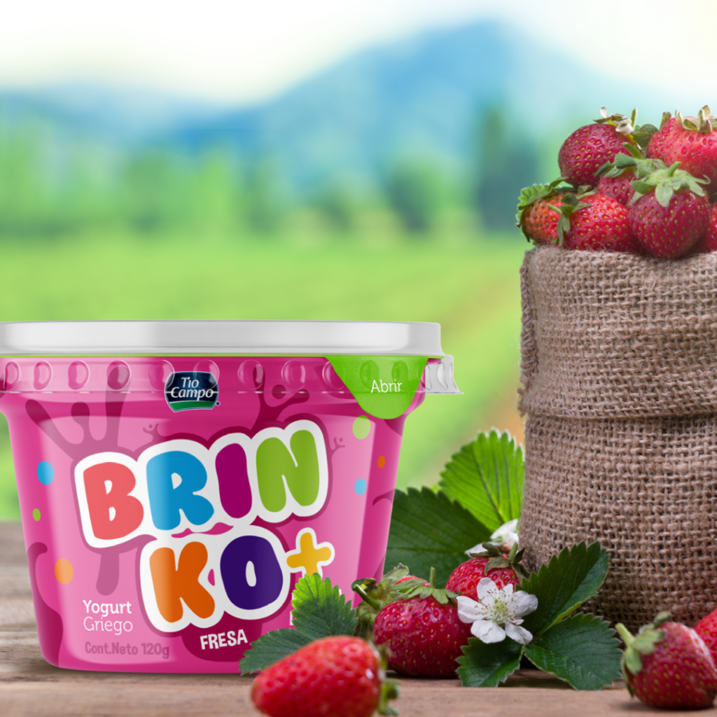
Imagery Support Concept
Strong imagery is essential to communicate the concept with clarity and intention. It defines how the product is perceived, creates emotional connection, and reinforces brand positioning at first glance. By maintaining visual coherence across every element, the concept becomes more focused.